August 31, 2011

Price Of Weed Infographic

August 31, 2011
Marijuana on a Scale

From floatingsheep.com

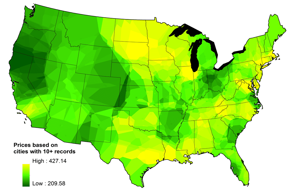
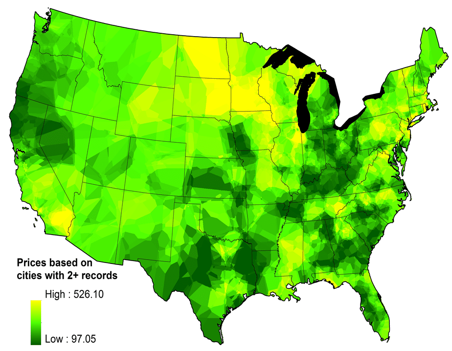
We’re very happy to report that a new FloatingSheep map is featured in the September issue of WIRED magazine under the title of “Infoporn: O Say, Can You THC?” [1]. Our map shows the differences in the retail price of marijuana based on user generated reports from the PriceofWeed website. According to WIRED, it offers “a look at the sprawling gray market that gets some high and others heated.”

Retail Price of Marijuana Cost Surface
Interpolated from points where n > 2
Price Of Weed
Green = lower prices; Yellow = higher prices.
One of the things that jumps out clearly is the low prices associated with the marijuana production sites associated with Mendocino, Trinity and Humboldt County in California as well as Kentucky and Tennessee. See this National Drug Intelligence Center report on the distribution of marijuana production by state.The map featured in WIRED is taken from a much more detailed research paper focused on the potential for user-generated data to shed light on underground economies such as marijuana use. The map relies upon thousands of user reports on marijuana purchases referenced to city locations from the Priceofweed website (see our earlier posting). After cleaning the data to get rid of the outliers, we created a continuous surface using a statistical interpolation technique known as kriging to identify the average variance among price differences through a spherical semivariogram model. To obtain a price for each location show in the map above, an interpolated value was estimated as a weighted average of prices from its twelve neighboring points.

One of the issues in generating these maps is how many observations we would require at each point (or city) before including it in interpolation. Increasing the number of observations (e.g., n > 10) helps control error in the average price at each point but limits the number of points. Lowering the sample size requirement (e.g., > 2) results in more points upon which to base the interpolation but increases price variance. In order to visualize these differences compare the map above (n > 2) with the map below (n > 10). While the first map shows a finer resolution of price variation (albeit with a decrease in the accuracy of the pricing data) it is consistent with the patterns resulting from the rougher resolution in the second map.

Retail Price of Marijuana Cost Surface
Interpolated from points where n >10
Price Of Weed 2

Share:

Facebook
Twitter
Pinterest
Reddit
[js-disqus]
Recent & Related Posts